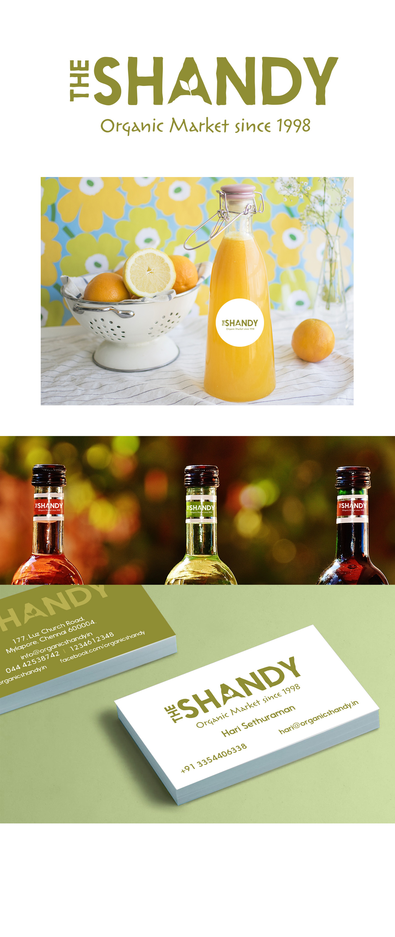
The Shandy
The Shandy is a farmer’s market for fresh organic veggies, fresh fruits, milk and everything else fresh and organic. An identity design incorporating this ‘freshness’ had to explore and convey several subtle shades of meaning. Besides being fresh, it also had to exude a certain level of honesty and evoke trust.
A deeper look into the personality of the brand revealed further layers – The Shandy did not have to pretend that it was earthy, organic and natural. It was all of these in spirit. We played with fonts with just the hint of a graphic element to bring all the subtle variables and shades of meaning together. Thus, the unevenness of the font with the leaf subtly accentuating the alphabet “A”. An earthy green lends a natural tone to the brand and keeps it to the right shade of ‘subtle’.
Brand Identity